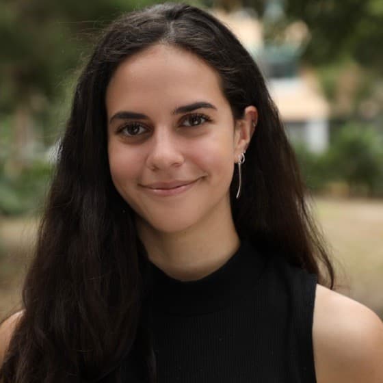
A conversation with Maya Dawda, our Project Manager
Introduction
Our team recently launched a complete refresh of the Five Bridges brand, a national organisation providing employment support services to all Australians.
The brand evolution and website redesign were an incredible collaborative effort by the team here at What Works, with everyone from designers to developers lending their expertise to the job.
The outcome is something to be proud of, even if we say so ourselves. Through the fresh, revamped website and branding, we were able to actualise the client’s main goal of evolving the brand while staying true to its core.
To see how the magic happens, we chatted to the person in charge of making sure all the pieces fell into place. Maya Dawda is our incredible Project Manager who worked tirelessly to get this job over the line.
Hear from Maya
What was the main goal the client wanted to achieve from the rebrand?
We talk a lot about evolution vs revolution in branding; Five Bridges is a solid example of evolution. It's an organisation that has been around for 20 years, grown significantly, and built a strong reputation in that time. The goal was to bridge the gap between then and now, to create an identity that reflects the organisation as it stands today and is flexible enough to support growth into the future.
What steps did the team take to achieve that end goal?
We approached this as a two-phase project: brand first, then website.
For the rebrand, we started the process (as always) with research and inspiration gathering. We then used that to explore stylescapes, which flowed into concept development and refinement before landing on a well-rounded, fully formed brand. We always pull together brand guidelines to keep application consistent, usually accompanied by the creation of key collateral in the new identity.
For the website, we start with a jobs-to-be-done exercise to understand what the site needs to do before we think about what it looks like. That informs the siteflow, which then gets designed in line with the brand and handed to development. We close out with internal QA followed by client QA, which is where we surface and resolve any bugs, CMS updates, and final fixes before go-live.
Throughout both phases, we weaved in regular internal check-ins to keep creative momentum flowing, alongside consistent client meetings to stay aligned.
What was the biggest challenge of the project?
Earning trust in the new! With any organisation that’s been around for 20 years, it’s not just about redesigning a logo but honouring the hard yards gone into building a strong reputation in the first place. The challenge came in balancing fresh with familiar; moving the brand forward while staying grounded in its core principles.
What did you feel was the biggest win during the rebranding process?
Seeing the two phases click together. Brand and website can sometimes be treated as separate conversations, but the two-phased approach meant ideas and execution flowed into each other really naturally, keeping both phases incredibly intentional.
Anything or anyone you wanted to call out for really lifting the project?
The whole team did such a great job. Sof on design across both brand and website, Rachael on copy, Saransh on development, and Eamon for creative direction throughout. This was one of our larger engagements in terms of both scale and time investment. People across What Works stepped in at different stages, and that collective effort made all the difference.
 Rachael Rosel
.gif&w=3840&q=75)